Home
The Home page shows the main data related to agents.
Data Today
New conversations
Number of conversations created from 00:00 to the current time, including incoming and callback conversations served by all agents.
Ongoing conversations
Number of conversations that are currently served by all agents.
Online agents
Number of logged-in users (agents and admins), including those who are online, invisible, busy, and away.
Messages
Number of messages sent successfully from 00:00 to the current time, including the messages sent by customers, agents, and the system.

Conversations
Trend of conversations, including incoming and callback conversations served by all agents.
The graph can be changed based on the time range, time granularity (hourly, daily, weekly, or monthly), channel (app, web, WeChat, or Weibo). You can also choose to use different display graphics, such as diagram, area graph, histogram.
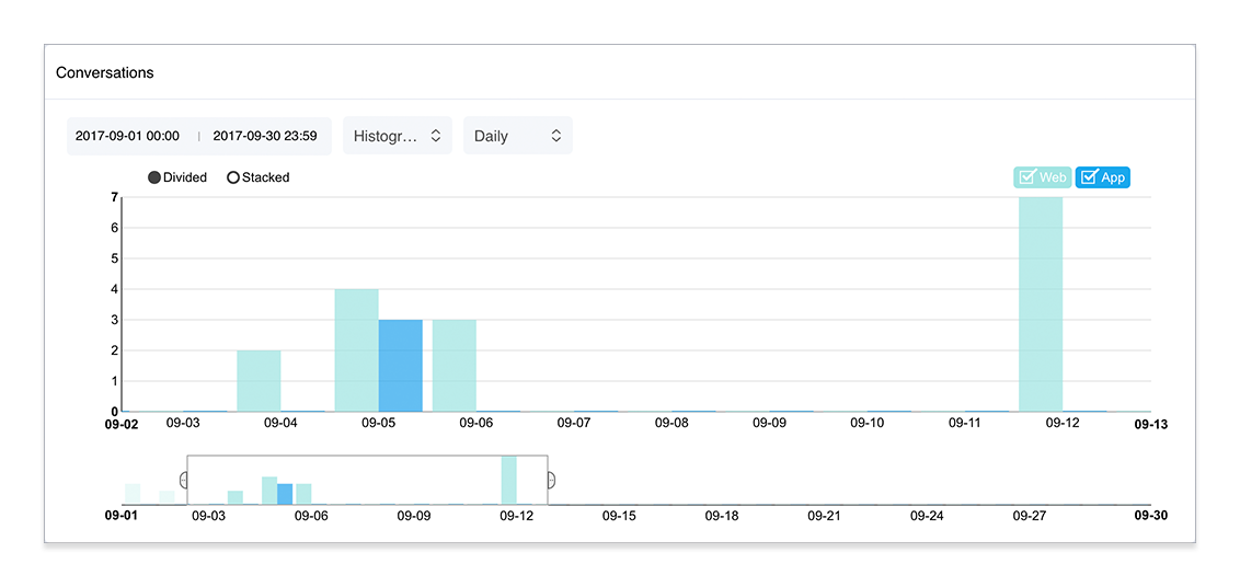
The following figure shows a histogram for daily conversations in four channels: app, web, WeChat, and Weibo.

The buttons are as follows:
(1): Set the start time and end time of conversations. The data overview for that time period is shown below the graph.
(2): Select the presentation.
- Diagram: displays the data for different channels with curves in different colors.
- Area graph: displays the data for different channels with areas in different colors.
- Histogram: displays the data for different channels with columns in different colors.
(3): Set the time granularity of the graph. It can be:
- Hourly
- Daily
- Weekly
- Monthly
(4): Set the channels for the graph. They are:
- App
- Web
- WeChat
- Weibo
(5): Set the display of the histogram.
- Divided: displays the data for each channel according to the time dimension.
- Stacked: displays the amount of data for each channel and the total amount of data for all channels according to the time dimension.
(6): Data overview. Drag the scroll bar on the overview chart to display data for different time periods, and adjust the width of the scroll bar to show more data or less data. Place the cursor outside the scroll bar and a plus sign (+) will appear. Click the plus sign to view all the data on the overview chart.
Messages
Trend of messages sent by customers, agents, and the system.
The graph can be changed based on the time range, time granularity (hourly, daily, weekly, or monthly), channel (app, web, WeChat, or Weibo). You can also choose to use different display graphics, such as diagram, area graph, histogram.
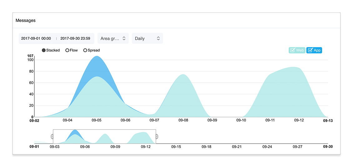
The following figure shows an area graph for daily messages in four channels: app, web, WeChat, and Weibo.

The buttons are as follows:
(5): Set the display of the area graph.
- Stacked: displays the amount of data for each channel and the total amount of data for all channels according to the time dimension.
- Flow: displays the amount of data for each channel according to the time dimension. The larger the area, the greater the amount of data.
- Expand: displays the proportion of data for each channel according to the time dimension. The larger the area, the greater the proportion.
Agents' Conversations
Number of conversations served by each agent from 00:00 to the current time, including incoming and callback conversations.

Note: If there is no new conversation on that day, the report is automatically hidden.